Modals
While you can build completely custom modals with iFrames, many interactions with the user are simple enough to use pre-built modals provided by the Extension API.
Alert
An alert modal presents plain text to the user with a single button to acknowledge that message. You can configure the alert with a custom title (which defaults to the name of your extension) and/or custom text for the OK button.
The alert method returns a Promise that resolves to true if the user clicks the OK button, or false if the user dismisses the modal in some other way:
const client = new EditorClient();
client.alert('This is a message');
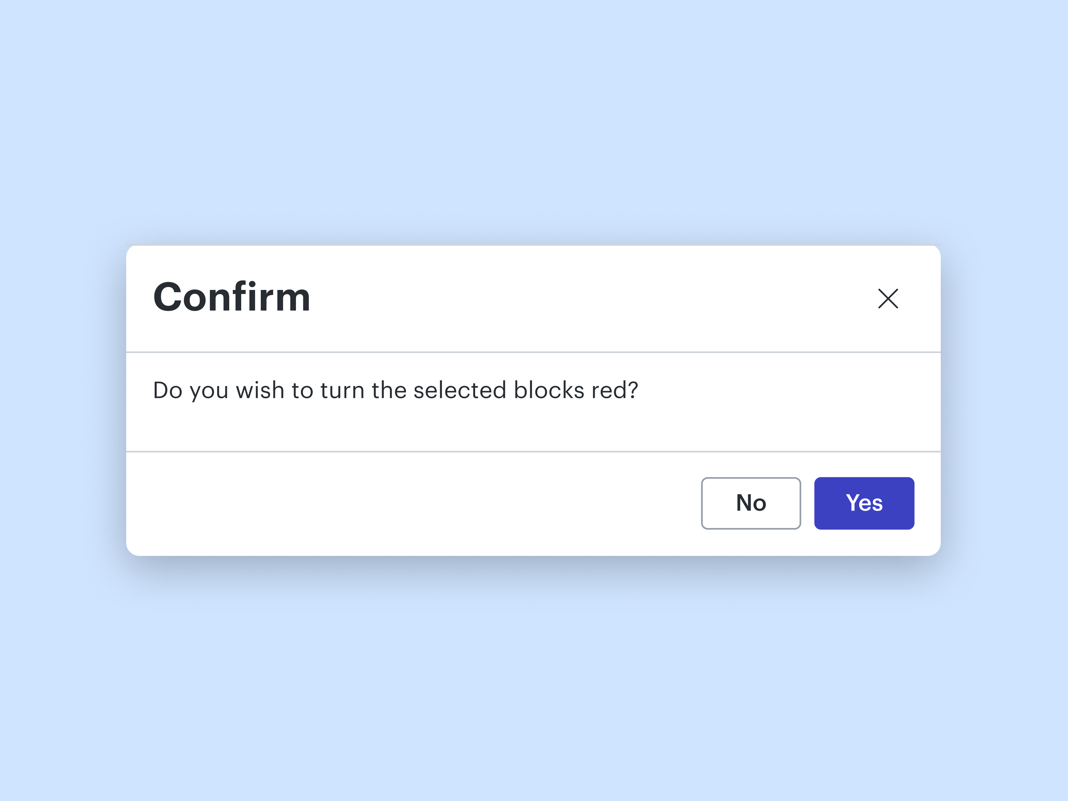
Confirm
A confirm modal presents plain text to the user with an OK and Cancel button. You can configure the confirm modal with a custom title (which defaults to the name of your extension) and/or custom text for the OK and Cancel buttons.
The confirm method returns a Promise that resolves to true if the user clicks the OK button, or false if the user dismisses the modal in some other way:
const client = new EditorClient();
const menu = new Menu(client);
const viewport = new Viewport(client);

client.registerAction('makeSelectionRed', async () => {
    if (await client.confirm('Do you wish to turn the selected blocks red?', undefined, 'Yes', 'No')) {
        for (const item of viewport.getSelectedItems()) {
            item.properties.set('FillColor', '#ff0000ff');
        }
    }
});

menu.addDropdownMenuItem({
    label: 'Turn red',
    action: 'makeSelectionRed',
    location: MenuLocation.Edit,
});
Updated 5 months ago